click to view larger
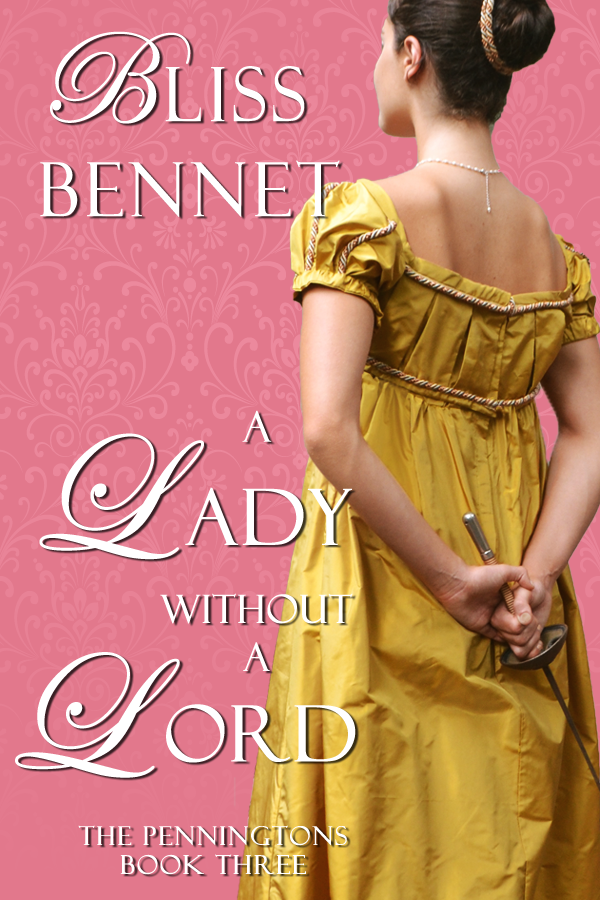
So excited about the cover for the latest book in the Penningtons’ series, A Lady without a Lord! My cover model is an actual world-ranked fencer, and gave me advice about the fencing scenes the book… [Read more…]
Bliss Bennet. The passion of historical romance.
Bliss Bennet writes smart, edgy novels for readers who love history as much as they love romance.
click to view larger
So excited about the cover for the latest book in the Penningtons’ series, A Lady without a Lord! My cover model is an actual world-ranked fencer, and gave me advice about the fencing scenes the book… [Read more…]
 I’m in the final stages of drafting Theo Pennington’s story, book #3 in The Penningtons series. And so I’m also working on putting together a cover for the new book, which will be titled A Lady without a Lord. Curious about how a cover gets designed? Step behind the curtain, and I’ll take you on a quick tour…
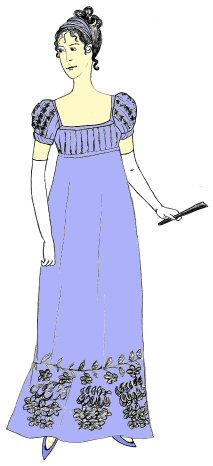
For me, step one is choosing a cover model, and then sewing her a historically-accurate dress to wear. Lucky for me, my daughter has a lot of friends who are eager to brag that they’ve been featured on the cover of a romance novel… [Read more…]

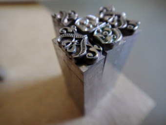
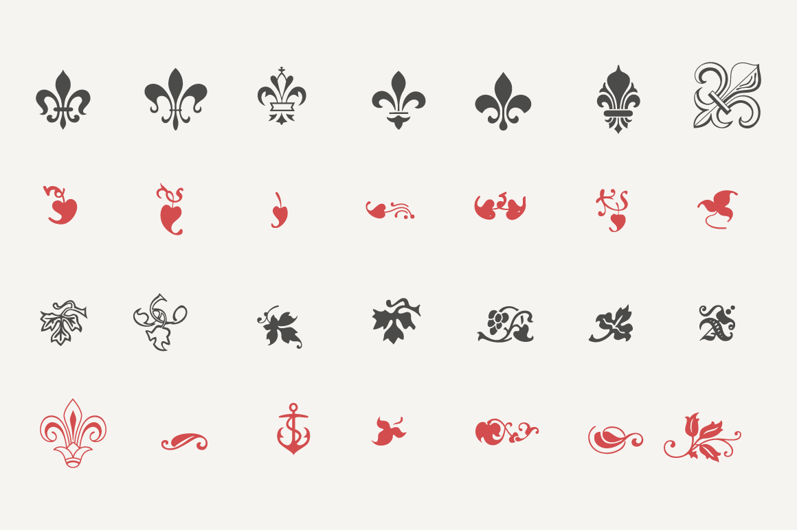
I’ve been obsessed of late with a small little something I didn’t even know the proper name of until just a few weeks ago. That tiny, decorative element that appears in a printed book, placed between two sections of type to indicate a pause in time, or a change in narrator or point of view. The word commonly used to describe it today is “dingbat,” but that term, according to the OED, did not come into use until the 20th century. And dingbat also refers to any typographical device other than a letter or a numeral. The older, and far more specific term, is the lovely word fleuron.
Fleuron, derived from the Old French word “floron,” or flower, has been in use at least since Chaucer’s day, to refer to any flower-shaped ornament: “So were the florouns of her coroun whyte,” Sir Geoffrey writes in the Prologue of his Legend of Good Women, describing Alceste, the Queen of Love. The word later became more commonly applied to ornaments on buildings, or those stamped or printed on books, coins, or other objects.
One of the most common ornaments, which I’ve included at the top of this post, is the Aldus leaf, or the heart-leaf. Other fleurons feature leaf shapes, flowers, swirls, myriad versions of the fleur-de-lis, and combinations of two or more of the above.

In our age of e-books, where the user (or reading device), rather than the book publisher or designer, chooses in what font, and at what size, the book she reads will appear, the aesthetics of interior book design often go by the wayside. But I’ve been seeing signs of late that even e-book publishers are trying to put a little more design oomph into their books. The Kindle version of Carla Kelly’s new historical, Softly Falling, includes not only decorative chapter titles and drop-caps, but a simple fleuron flourish to indicate section breaks.
I want my own e-book to look as beautiful as I can make it, and also to evoke the historical time period in which it is set. So I’ve spent far more hours than I should surfing the net, searching for period-appropriate (Regency-era) fleurons.
Thousands of fleurons are mine for the downloading as vectors via the web; thousands more are embedded in downloadable typefaces. Yet few ornaments among the multitude contain information about when they first came into use, or when they were most popular. The best book source that I’ve been able to find, Phillip Luidl and Helmut Huber’s Typographical Ornaments (Blanford Press, 1985), includes a brief description of the most common ornament styles to be found in different historical periods, but for some reason the book itself includes very few examples from the period he terms “Neoclassicism” (1770-ca. 1830).
Perhaps I should forget about the historically-accurate, and just go with the beautiful?

Does interior design matter to you when you’re reading an e-book?
Photo credits:
Fleuron spread: Creative Market
Fleuron type dies: The Center for Book Arts
Heart/lily fleuron: Vectorian.net
